An inclusive App for art enthusiasts and aspiring collectors
Situation
Most art auction apps weren’t created with disabled users in mind, and they usually cater to high-tier collectors.
Task
Create an App that users with disabilities can use easily.
Provide more information on up-and-coming artists.
Action
Research Ideation Lo-Fi and Hi-Fi prototyping
Results
Users successfully navigated through the app to browse content and place a bid.
The app addressed and solved accessibility issues.
01. Research
Competitive audit
The goal of the competitive audit was to compare the auction and overall experience of each competitor’s app as a new user and returning user.
Key competitors
Auc Art, a platform to discover and buy emerging art
Artsy, the world’s largest online art marketplace
Sotheby’s, the world’s largest, most trusted and dynamic marketplace for art and luxury
Etsy, a platform that sells art and crafts by independent artists.
(Auc Art and Artsy are direct competitors; Sotheby’s and Etsy are indirect competitors).
Identified opportunities
Provide features for users with disabilities
Provide a good range of languages
Create a platform with a friendly and engaging tone, community-focused that could include features such as user reviews, ratings, and live chat
Embed the latest modern phone technologies such as fingerprint recognition and audio assistant
Adapt higher-end platforms user experience and features to a platform for emerging artists and more affordable art.
User personas
For this project, the user research was conducted through user interviews. I interviewed four users with different gender, age, location, education, marital status, and work.
A primary group of users identified through research was art enthusiasts with visual impairments. Study revealed the group was eager to buy art but couldn’t since apps on the market do not answer their needs.
Another group was young professionals who would like to learn more about art and start a collection, but don’t find art apps meet their needs and budget.
Analyzing the content from these interviews helped create two user personas:
Leah
Age: 40 Education: Doctor of Medicine Hometown: New York Family: Single, 1 kid Occupation: Doctor
Leah is a doctor who needs an app that’s easy to use because she has visual impairment. As a doctor Leah is very busy. She works unpredictable shifts and doesn’t have time to visit art galleries anymore. So nowadays the perfect leisure time for her is to order a meal, open a bottle of wine and check online art auctions while listening to her favorite classical music. She feels frustrated when she wastes her time on apps that she can’t use easily.
Goals
Wants to spend quality time on her hobby
Take her mind of work, enjoy art she buys online
Frustrations
A lot of auction apps are not designed for people with visual impairment like her
Too time consuming to search for art she likes
Lack of detailed photos
Matteo
Age: 25 Education: Degree in Law Hometown: Barcelona Family: Dating, no kid Occupation: Junior at Law firm
Matteo is a junior at a law firm who needs an app that offers up and coming art and more educational content, because he wants to know more about art and start collecting on his small budget. Matteo is an ambitious and hard working young man who wants to become a partner at his law firm. He was introduced to the art market by his boss, and since then has developed a genuine interest in it. He’d like to start collecting, but it’s hard with limited resources and knowledge.
Goals
Wants to learn more about art
Wants to invest in up and coming artists
Frustrations
Lack of affordable art
Not enough young up and coming artists
Doesn’t know enough about art, so doesn’t dare to buy yet
Most apps are in english
“A young artist today may be the next Picasso.”
Pain points
Accessibility
Users with visual impairment struggle to use Art auction apps.
Time
A lot of users find it too time-consuming to search for art.
Incomplete offer
Users were frustrated by the lack of up-and-coming artists, and wanted more affordable art.
Non inclusive
The study showed that most apps were only available in English and only catered to a certain user group.
02. Ideation and Low Fidelity Prototype
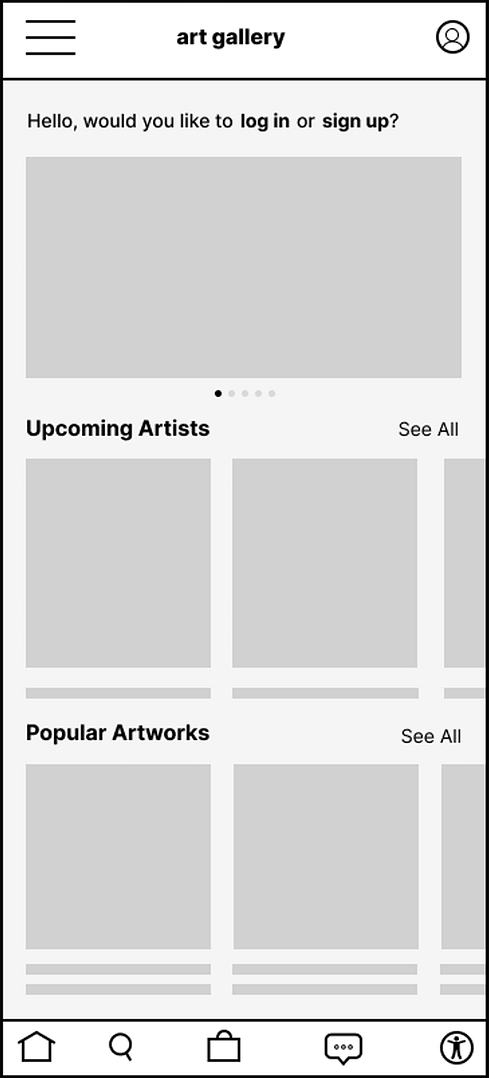
Low Fidelity prototype
Ideation and paper wireframing
The goal was to ideate as many ideas as possible on how each screen of the app could be laid out. After identifying the most user friendly elements, new wireframes were designed to help users access artists and artworks smoothly.
The ideation phase helped me explore as many ideas as possible on convenient user flows. I identified the design elements that would potentially meet user needs, such as accessibility settings and inclusive options.
Digital wireframing
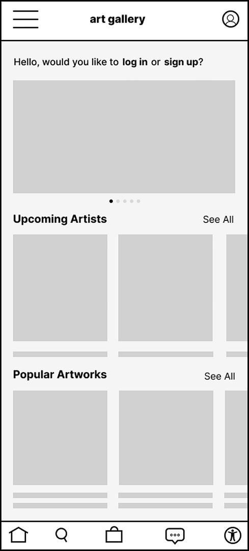
Using the paper wireframes as a starting point and referring to user study findings, I designed digital wireframes that took the app one step further in usability.
Test the low fidelity prototype (best viewed on desktop or in the Figma app).
An unmoderated usability study was conducted, where participants were asked to try to complete basic tasks in the app. The study showed recurring pain points that affected the experience negatively.
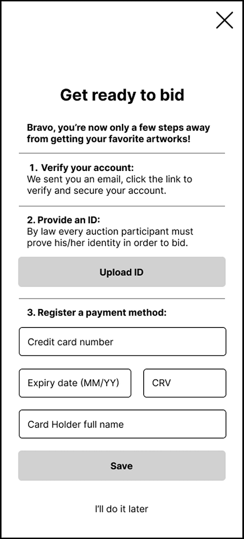
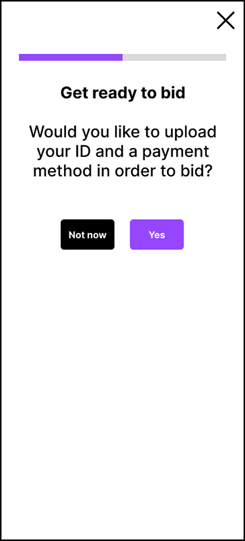
1. For most users, being requested to provide their ID and credit card details during Sign-up was not adequate, so an insight was to put this step at another moment of the user journey, and to be more explanatory about it.
2. Most users didn’t find the footer menu icons easy to identify, an insight was to add text to icons to help users identify the features.
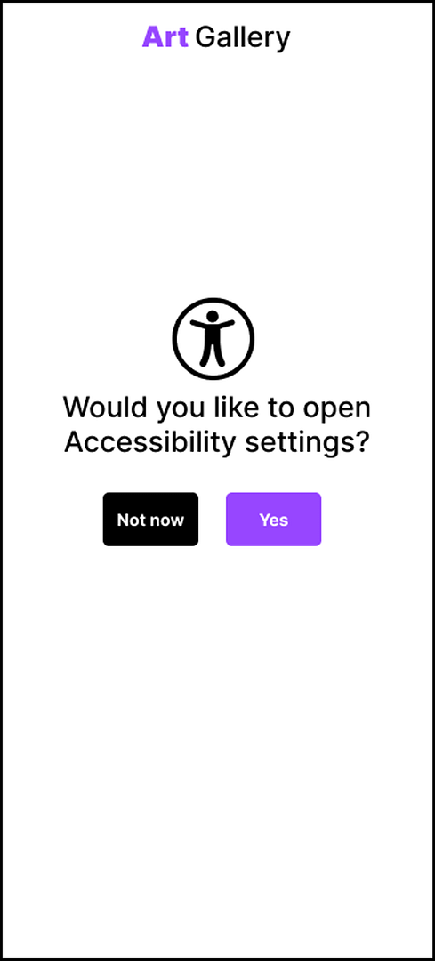
3. Most users struggled to find the accessibility button, the participant with visual impairment complained it wasn’t accessible at app opening.An insight was to move it to a more prominent position
04. High Fidelity Prototype
Iterating and refining design
After conducting the usability study, it was found that accessibility settings were not taken into account enough, and that the footer icons lacked clarity.
It was also found that some steps during registration were feeling too intrusive to users, with a risk of a dead end early in the process.
Iterations
Before
After
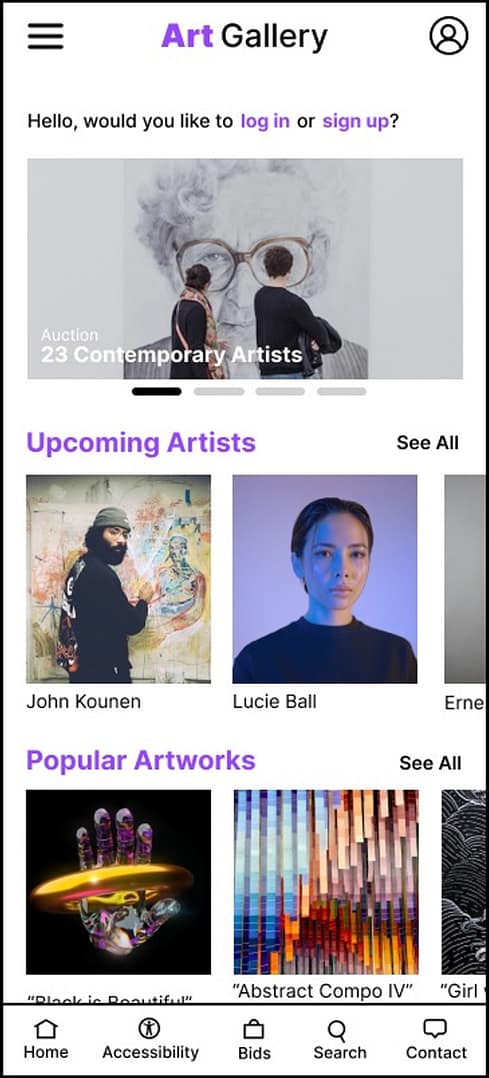
On early design accessibility settings were available, but not prominent enough. On the new iteration, the accessibility settings appear as soon as the app launches.
In the lo-fi prototype the bottom navigation showed icons only: the usability study showed that the menu wasn’t clear enough to users. The issue was addressed by combining text and icon for each menu icon, and increasing the navigation bar height for better clarity.
Before
After
Before
After
Early design prompted users to provide their proof of ID and payment method right away. After the usability study, it was decided to let users have the option to go through this step at a later stage.
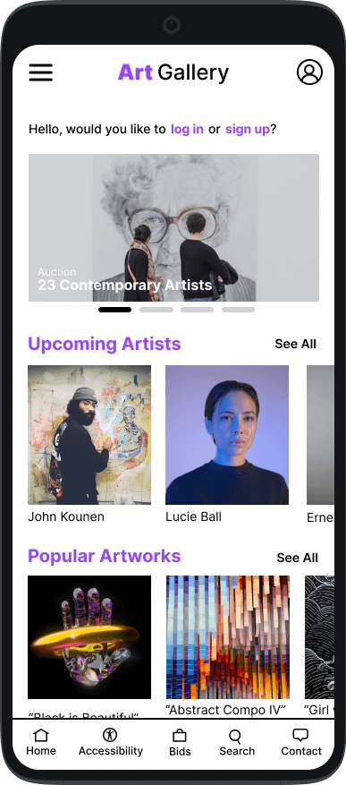
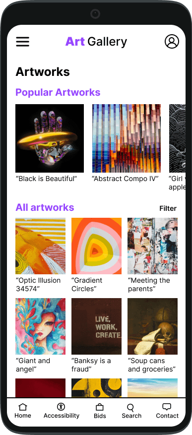
Key mockups
Test the high fidelity prototype (best viewed on desktop or in the Figma app).
Focus was put on accessibility at app launch for users with visual impairments.
Icons, AAA colour contrast, space and readable typefaces improved user experience.
A quick access to the accessibility settings was provided on the bottom menu.
Takeaway
The app succeeding in pleasing users who priorly had difficulties using other Art auction apps. Designing a user-centred product is an ongoing process that requires changes along the way to meet users’ needs. It’s important to avoid biases at all times as they often make us overlook areas that need improvement.